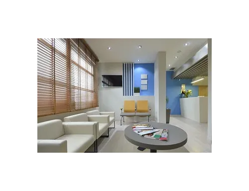
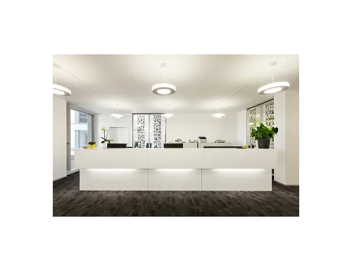
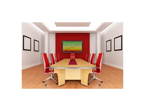
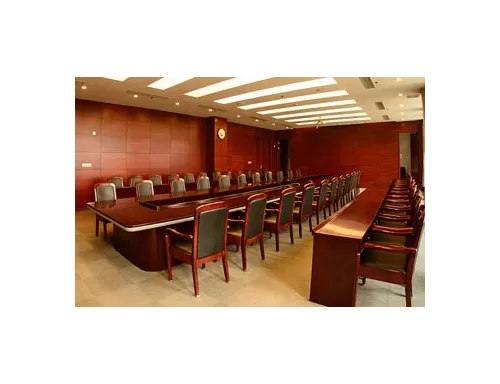
Display Area

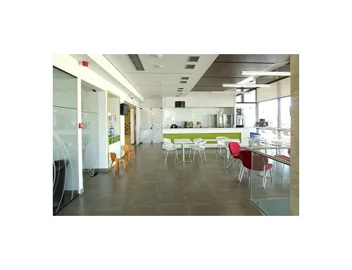
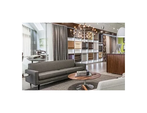
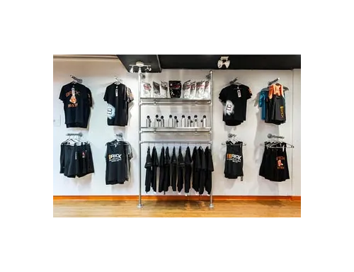
The display area should give a positive image of the store. The design should guide the customer to locate items easily. No one wants a cluttered space let alone spend money getting irritated. The display area should attract buyers and customers. The design should encourage and motivate them to stay and enjoy for a while.
The market strategy behind color and design of the display area is to encourage the customers to do impulse shopping. One can never take the risk of an average design display area. For the display area a theme is very important. Develop and determine a central theme.
Just like lighting plays a huge role in the sales rate, research has shown the color influence is so much on consumer’s buying behavior. It should coordinate other design elements of the display area i.e. floor, ceiling, display racks, tables etc. The design of the display area should be flexible to change according to the needs and requirements of the workflow.
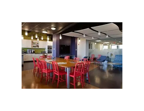
Colors play an important part in the overall theme of a display area. You can communicate a message with the help of colors alone. Colors trigger psychology and can create balance to the design. Also color aids in focusing the attention to the desired elements.
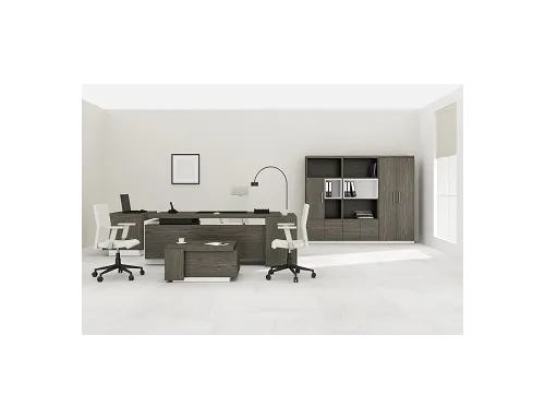
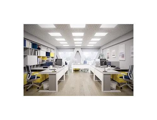
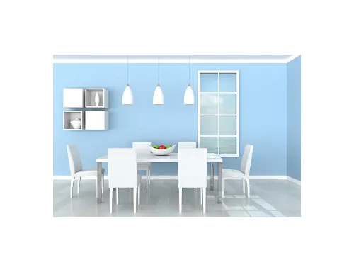
Best colors for attractive display areas ranges from vibrant colors to muted tones and soft hues to neutrals. Mostly neutrals are most wanted because it gives a nice sleek backdrop for the items to display and to create focus on them. Proper lighting and placement of design elements can create a nice and well balanced ambiance.
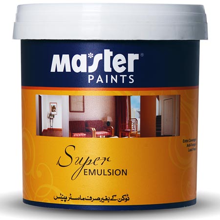
From Master Paints’ Luxury and Royal Matt emulsion range of wall paint colors, each paint color has a nice touch to it when used alone or in combination. Let us guide you to design a dynamic display area. If you are looking for a variation of white in lightest tones, check out Dove White -46- Super Emulsion or Barley White -45- Super Emulsion and Bluebell White -43- Super Emulsion.
For dark hues the beautiful Dark Brown -57- Super Emulsion and Deep Blue -51- Super Emulsion.
