Reception

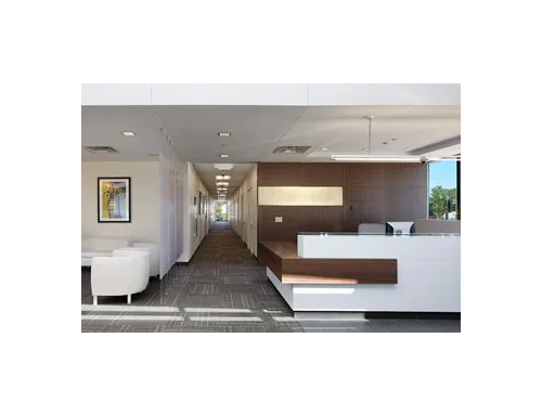
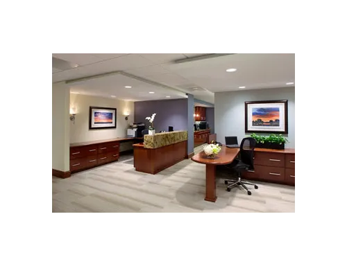
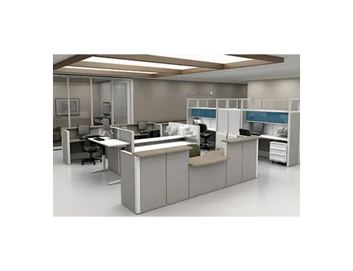
Reception area is the first thing that we see when we enter the building. From the reception desk to the color used in the area, one must opt for the facility brand image unique ideas. Therefore, the design and color of a reception area should be selected with care. It is a great way to communicate the brand image of the healthcare.
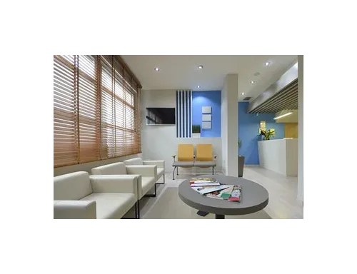
When it comes to a healthcare facility, colors play an important role in uplifting emotions of building users. Using different colors to paint facades helps in way finding and identifying various units as waiting areas and receptions etc.
Master Paints cares for the first impression and provides a huge range for you to create, renovate and uplift a dull and boring reception area. It helps in improving interactions between the receptionists with patients and people visiting the facility for work or educational purposes.
Use Brown: as a natural color, brown color is often found in nature. Being the color of earth, brown evokes a sense of security and stability. Try this Cameo -7014- Royal Matt Emulsion and Brazil Nut -7007- Royal Matt Emulsion or perhaps a more subtle Basket Beige -7011- Royal Matt Emulsion.
Use Mauve: mauve can be used to create calmness and serenity. The psychological effects of purple and mauve are soothing and comfortable. Check out Mocha Mauve -7012- Royal Matt Emulsion or a lighter shade Fretwork -7008- Royal Matt Emulsion to attract more attention.
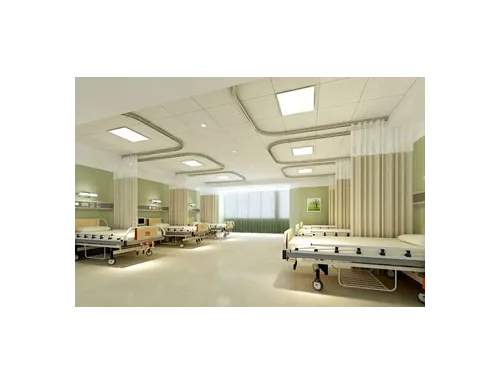
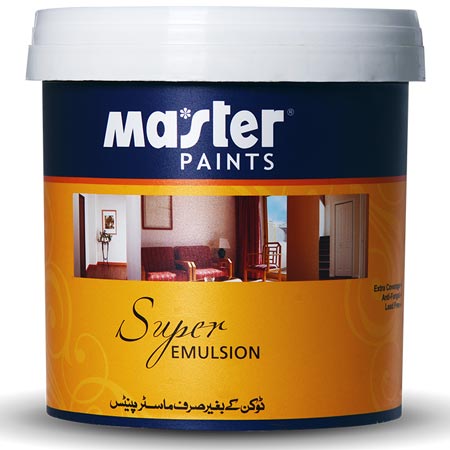
Use Green: to create a fine and fresh atmosphere, which is the key feature for a hospital reception. Green is used for its many benefits. Master Paints has Fresh Green -7020- Royal Matt Emulsion or a subdued Lime Juice -5028- Luxury Emulsion and for a lightest tint of green check out the beautiful Soft Green -68- Super Emulsion.
