Cafeteria

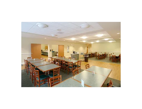
An efficient and smart approach towards the design in relation to the people and user group can aid in a cheerful and lively cafeteria place. A cafeteria should meet the needs of all the groups that use the place, from doctors to nurses and staff to patients and visitors.
Designers have a huge role and impact in the healing journey of patients. They can play their part in contributing towards a healthy environment and well-being of patients, their families, staff and every other person visiting or using the facility.
Cafeterias have great impact on supporting a less stressful patient’s journey. Bringing the greenery indoors and the landmarks contribute a lot in developing an aesthetically pleasing space.
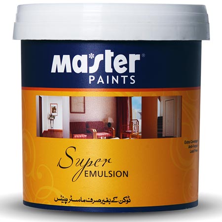
As bright colors boost appetite and hunger and aid in creating bright live-able spaces, Master Paints covers this by providing beautiful bright tones and their variations. From our Matt Emulsion range try our Tile Red -5041- Luxury Emulsion and M. Light Red -28- Super Emulsion which are the lighter tones of pure red, as well as Poppy -54- Super Emulsion which is a beautiful shade of red. Yellow being one of the bright colors is also a favorite when it comes to food areas. Basanti - 7030 - Royal Matt Emulsion which is a shade of yellow and looks so exciting when used as an accent color with Shell Grey -24- Super Emulsion or Black -30- Super Emulsion.
If you are not into reds, we advise you to go for a muted tone Orange -53- Super Emulsion which has the properties of red but look more calm and energetic. Coral -5052- Luxury Emulsion and Tangerine -5054- Luxury Emulsion are also light variations of orange.
If you want to play safe, try our whites in beautiful undertones of pinks and violets like Ash Grey -7032- Royal Matt Emulsion and Pink Violet -5064- Luxury Emulsion.
