Meeting Room

Although it’s not fair to judge a book by its cover, but the truth is, most people do. Similarly, the effect a reception leaves on its visitors will greatly impact what you think about the whole space. Of all areas, a reception needs to be very thoughtfully designed to make sure it’s welcoming and also interesting to people from all walks of life who visit there.
Using the right colors is one way of making sure it leaves the right impression on the visitors. The main goal is to keep the place friendly and hospitable but still formal. Some of the ideal ways of doing so is using monochromatic tones, using neutrals with colorful accents or over all using a warm color scheme with some bright tones in accessories or furniture.
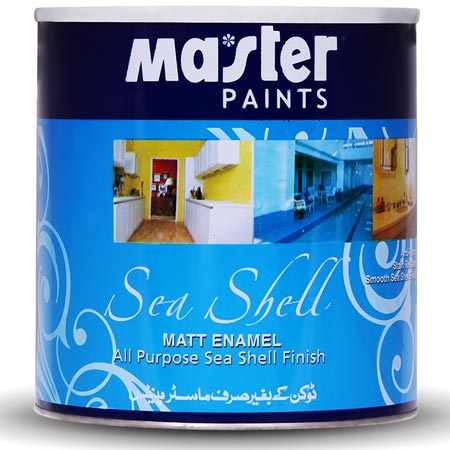
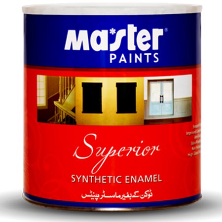
Master Paints not only provides you a with wonderful color palette for wall coverings but also provides a wide range to pick from for your wooden and metallic surfaces to create a unique style. If you look at the Master Matt Enamel series, it will provide you with countless options to use for doors, door handles, window frames, furniture and other small details. You can use its Midnight Blue, Orion, Rose White, Onyx, Apricot, Lavender White, Ivory or Daisy Chain to create an interesting effect in furniture, doors, windows or other details. Or you can pick Master Pale Cream, Sea Green, Navy Blue, Master Green, Smoke Grey or Master Champagne from the stain resistant Master Synthetic Enamel series.
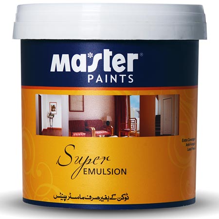
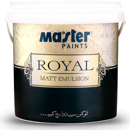
For wall coverings, Master Paints has you covered with a wide range of warm, bright and neutral tones to pick from. The Manila Tan, Mocha Mauve, Palace White, Basket Beige, Fretwork and Cockleshell are some of the fine options from Royal Matt Emulsion. The lead free, Mater Super Emulsion also has a wonderful range to create the best color scheme for a reception for instance, Mushroom, Peach, Oriental Space, Rose White, Cameo, Ash White and Copper are some of the unmissable options to create a warm and welcoming ambiance.

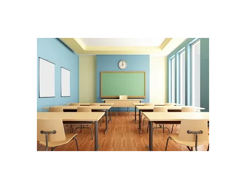
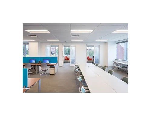
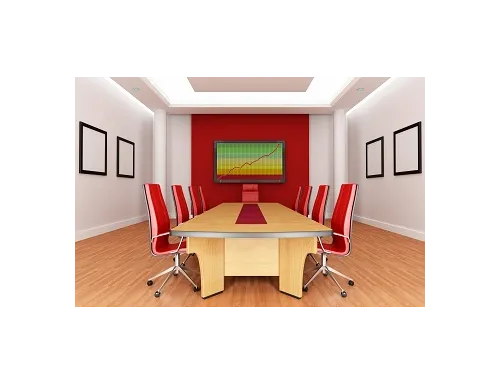
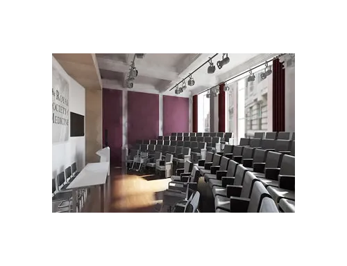
A meeting room or conference room is a space that’s not occupied at all times but is used frequently when multiple people come together to hold discussions. While some people recommend caffeine to increasing productivity during a meeting, a designer will recommend you a color scheme for the space to boost the output and help people stay focused.
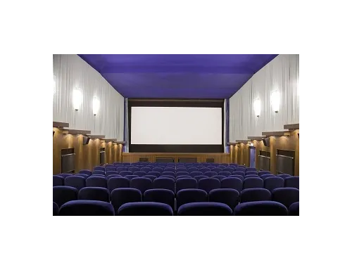
The right colors can have a major impact in all spaces from restaurants to doctor’s office, laundry rooms to receptions and from yoga centers to cinema halls. When picked rightly, the color scheme can make the space more comfortable and enhance positivity.
While using neutrals like grey emphasize on the formality of place, adding some stimulating colors will increase productivity among the workers and may as well help in keep the meetings in a fast forward mode. The Paprika, Peach Goddess, Manilla Tan and Off White from the Royal Matt emulsion Series and the Basanti, Apple White, and Fresh Green can create wonderful color schemes when used tastefully. The Master Super Emulsion with its super wash ability also has a pallet that can help you create some unique color schemes. For instance, Peach, Magnolia, Spring Leaf and Rose Petal can look great together when used in combination. Also, Deep Blue, M. Light Red, Master Green and Dove White can also create a striking look. For a more pastel color scheme, you can also use Bluebell White, Barley White, Ash White and Rose Petal, and add some darker tones in furniture pieces. For that choice, the Navy Blue, Master Antilope or Master Pale Cream from our Synthetic Enamel range can be some eye catching choices to use in contrast.
