Principal Office

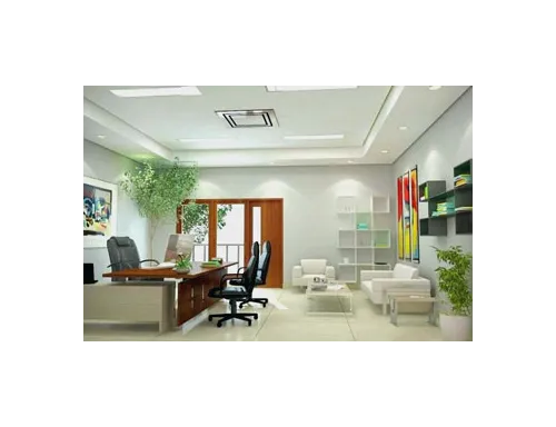
After the main façade of the building, the Principal’s office is probably the most important space. It not only creates an impression on the visitors but also sets the tone for what to expect from the rest of the school in terms of its outlook. Since it is multipurpose, it needs to be designed with keeping its nature of use in mind. A principal’s office needs to look like a place of authority and not like a place for informal gatherings.
In daily use, the room not only entertains various visitors (official and parents alike) but also holds meetings and discussion groups. So while keeping a formal tone in the design, it still needs to be welcoming. Picking neutrals or monochromatic tones is a great way of doing so. Though, to keep the space appear interesting you can pick a variety of neutrals and use their lighter or darker tones to develop a color scheme. You can play with light and use it to enhance the wall finishes.
Some of the many warm and attracting neutral tones that Master Paints offers in its Royal Matt Emulsion for a rich and luxurious finish are, Manila Tan, Basket Beige, Cockleshell, Fretwork, Off White and Motia. You can also explore the Master Super Emulsion palette for its Mushroom, Magnolia, Rose White, Shell Grey, Copper, Dove Grey and Barley White. While all of these options are not-to-miss, pairing them together to create a pleasing effect is the key.
You can also add some delightful shades in combination for your wooden and metallic surfaces to create the desired ambiance. From the Master Synthetic Enamel series, Navy Blue, M.B Green, Smoke Grey, Dark Grey, Clay, Coriander and Master Champagne are some classic neutrals that can bring a warm, welcoming yet formal touch to the office.
